by:forcode
forcode: finally made the first use arcgis Figures: U.S. states and the use of liquefied petroleum gas filling the power users in the proportion of electricity as fuel distribution. In fact, the majority of statistical research with a friend, as long as the will is very simple arcgis enough knowledge, can show results on a map, showing the findings very helpful. forcode in CLH with the help of colleagues, learned how to use arcgis do the most simple statistical map. To help latecomers, forcode decided to write a arcgis used for statistical map of the Concise Guide.
address the full text of this article:
http://www.qixianglu.cn/628767 . html
Below is a diagram of specific steps:

1, below the first to look at the data, this is a conversion from excel from the CSV file (comma separated variables), the first row in the United States all the state, the second column is the states to use liquefied petroleum gas filling And electricity as fuel for electricity users in the percentage (behind the merger in order to ensure that the data was identified as the number of, so will be removed from the Bai Fenhao). Is the third to six primary schools and below, middle and high schools and universities and higher educational levels among the percentage of electricity as fuel.
2, and then, In order to obtain all the U.S. states of the terrain layer, from arcgis onboard data loading, in the file menu, click New create a new document: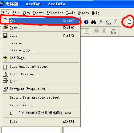
3, in the pop-up dialog box, select the USA in USA.mxt, then click OK:
4, we can see that the increase Contains many layers, we need the layers in the Conterminous United, right-click on the map using a red circle marked on the United States, in the pop-up menu, select Data in the Export Data: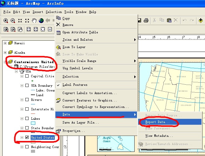
5, the Export Data menu settings Output USA.shp save the path, then click OK, we get all of the United States, topographic layer documents, in Figure: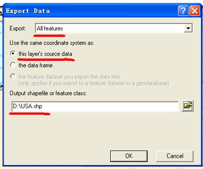
6, click on the menu bar on the new document button, and then the pop-up dialog box choose not to save, and this new An empty map: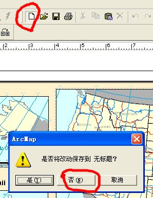
7, in the file menu, click Add Data, or click on the Toolbar at the end of black and yellow (Figure), loading data: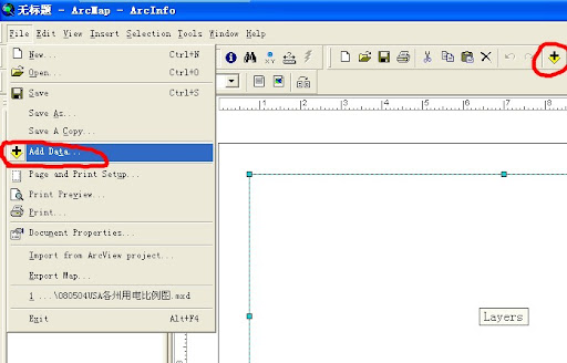
8, the first load just kept USA.shp document: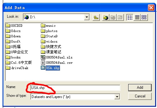
9, loading the document is the result can be seen To the U.S. state boundaries:
10, and then loaded on the map need to show that the statistical data, 080504 fuel.csv: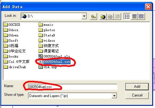
11, after loading in the window layers can be seen in the loading of the two documents:

12, right-click the USA layer, in the pop-up menu, click Open Attribute Table, open the USA this layer attributes table:
13, in the pop-up window attributes STATE_NAME attention to this field, this is the United States in various states of the state: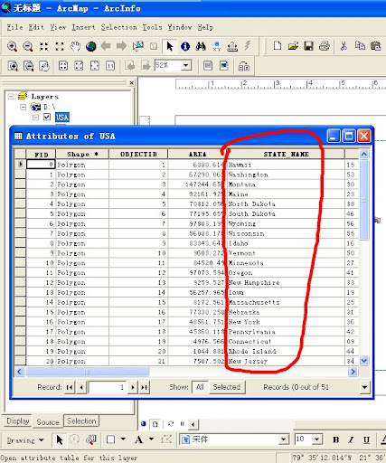
14, the same right-click 080504 fuel.csv this layer, click open Open this CSV file:
15, fueltype attention to this field, but also the United States in various states of the state, and the USA needs in this layer STATE_NAME exactly the same (including the case to the same), so as to merge data in the back when the match:
16, then right-click USA Layers, click Joins and Relates in Join: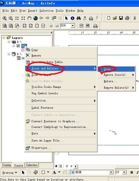
17, Join Data window in the combined data set of parameters, as shown, to layer in the USA and 080504 fuel.csv STATE_NAME layers in the field fueltype match, set up after Click OK:
18, once again see the USA layer attribute table, you should see a csv file in the field have been merged into one of the: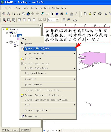
19, we can see that the merger has been completed:

20, right-click the layer in the USA to open the menu, select Properties items :
21, in Layer Properties window choose Sybology tab:
22, on the left choose Quantities under the Graduated colors, set up fields for the value electricity, said that states should show the percentage of electricity in the United States on the map:
24, further set Classes 8, stated that in accordance with state variable size of the value of electricity from shallow to deep-divided into eight groups, each with a different color settings, such as electricity in the percentage of 20.1%to 39%of the state is set to white, and the proportion of 90.2%to 95.6%between The state is set to All Black, and so on. The default is for each group, the same number as far as possible, so some groups may span the percentage of large, such as 20.1 percent to 39 percent of the nearly 19 percent poor and 60 percent to 67.9 percent of this group only the eight - Percentage points can also click Classify in the pop-up window in the group set up in accordance with the equidistance settings, such as 20%to 30%is divided into a group, 30 percent to 40 percent is divided into a group, and so on, there are other ways groups Optional.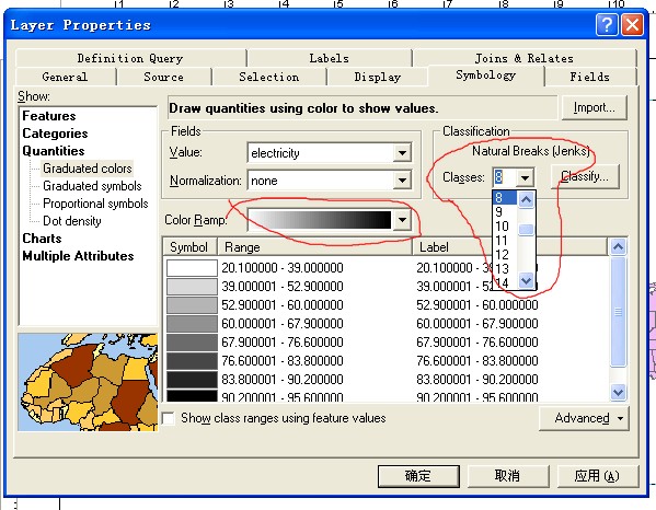
25, and then click Determine, under the plans have been the result of the original CSV form of electricity users in the U.S. states of the grouping of different colors on a map displayed in the United States, is very intuitive:
the future of new technologies and new trends in the various possibilities: Qixiang recordedhttp://www.qixianglu.cn
subscribershttp://feed.feedsky.com/woodphonereaders QQ discussion group: 11564958
readers to discuss - Qixiang their homes:http://www.douban.com/group/forcode

original link:http://item.feedsky.com/~feedsky/shehuixue/~6998740/71550347/1228159/1/item.html


No comments:
Post a Comment